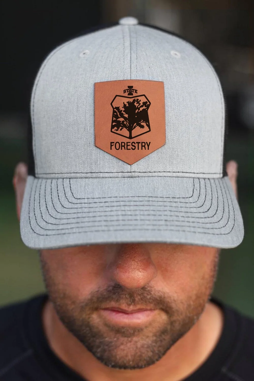
Designing a Forestry Crest with a Rich History
The Iowa State University Forestry Department had used the same crest for generations. The time finally came to update the crest, but the department wanted to preserve its long and meaningful history. Here’s how we did just that!
My Role
Graphic Designer
The Starting Point
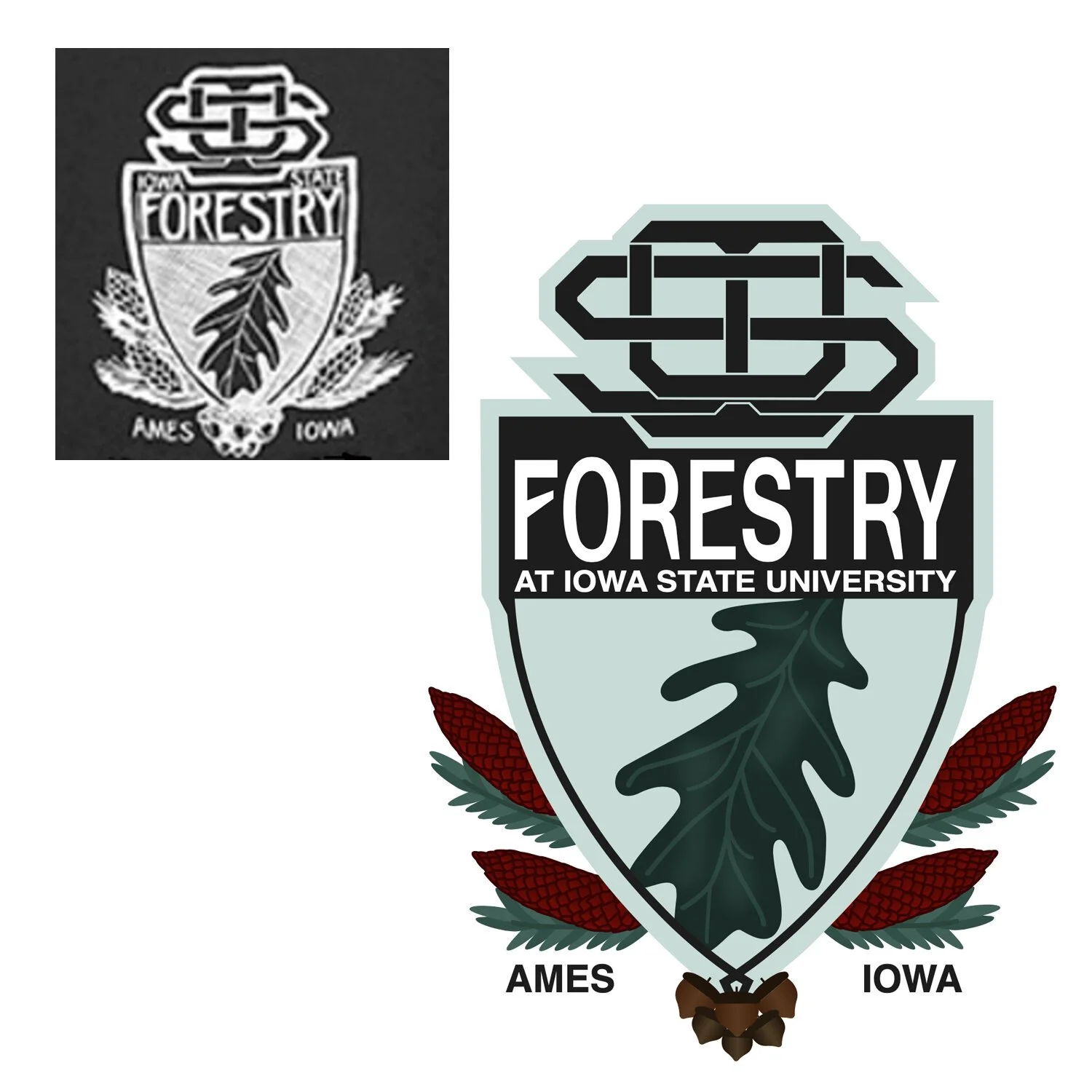
The crest the university had been using for decades was hand drawn, and the only existing file was a scanned image that had been passed from forester to forester. The project initially began as an effort to properly digitize the logo for use on the school’s website and for merchandise. They initially wanted the digitized crest to appear as close to the original as possible.
As it was, the original logo was jumbled and hard to decipher. It also featured an ISU logo that went against university guidelines. After seeing the crest fully digitized, the department voted to modernize it for future generations while paying homage to the department’s roots.
Creating A New Crest that Honors the Original
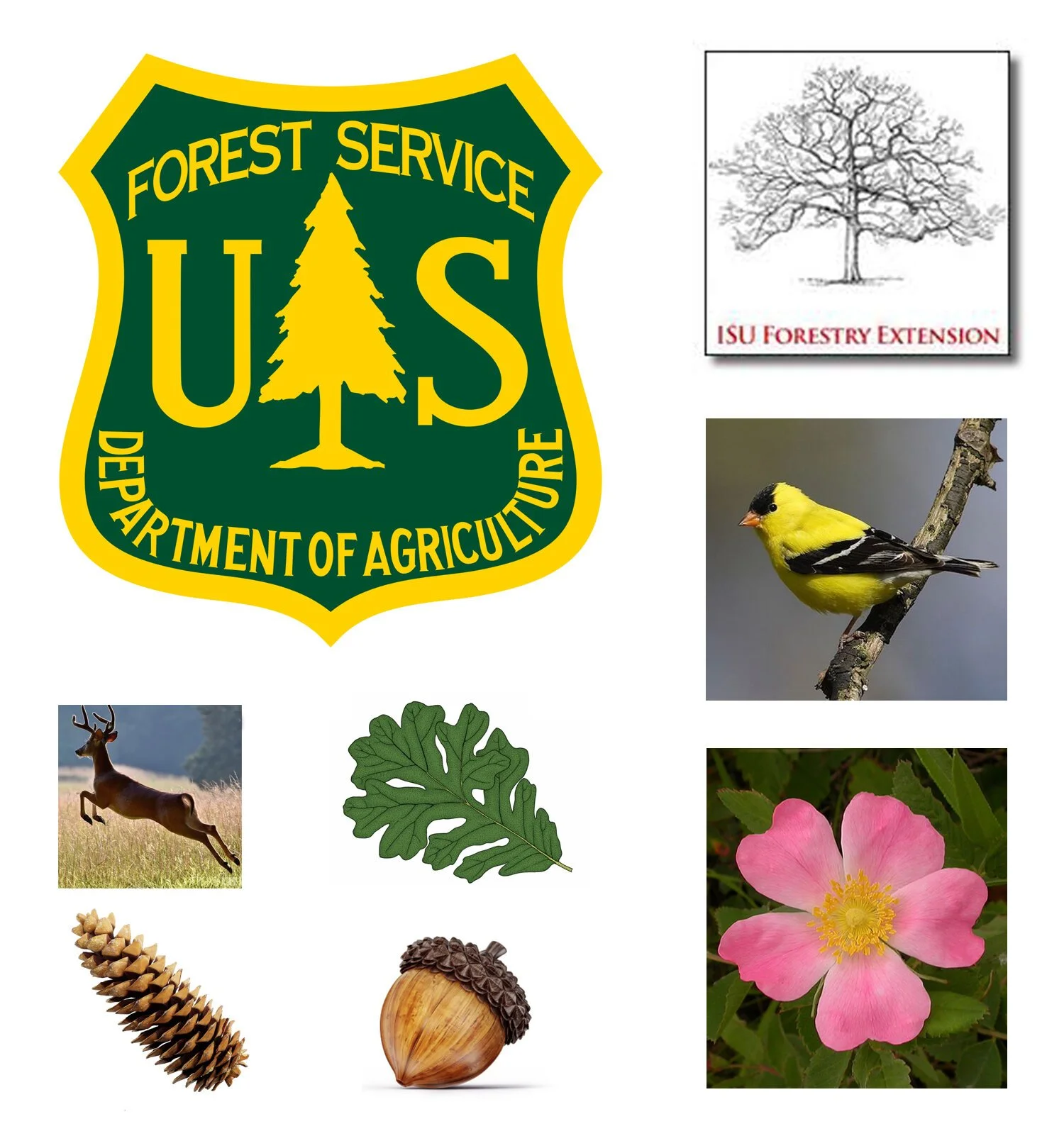
The new logo had to include the same oak leaf, acorn, and pine cone species as the original. The client also requested the crest include a buck, a prominent animal in Iowa. They asked if it would be possible to include additional symbolism, but left what those symbols should be up to me as the designer.
To reference other elements of Iowa's nature, I included the Iowa state bird- the goldfinch, as well as the state flower- the wild rose. I referenced the US Forestry Service Department of Agriculture crest in the logo, as it is one of the most recognizable symbols of Forestry in the US. I also wanted to feature a famous Burr Oak from the ISU campus that also appears in the ISU Forestry Extension logo, to tie the logos for the department together.
The Final Look
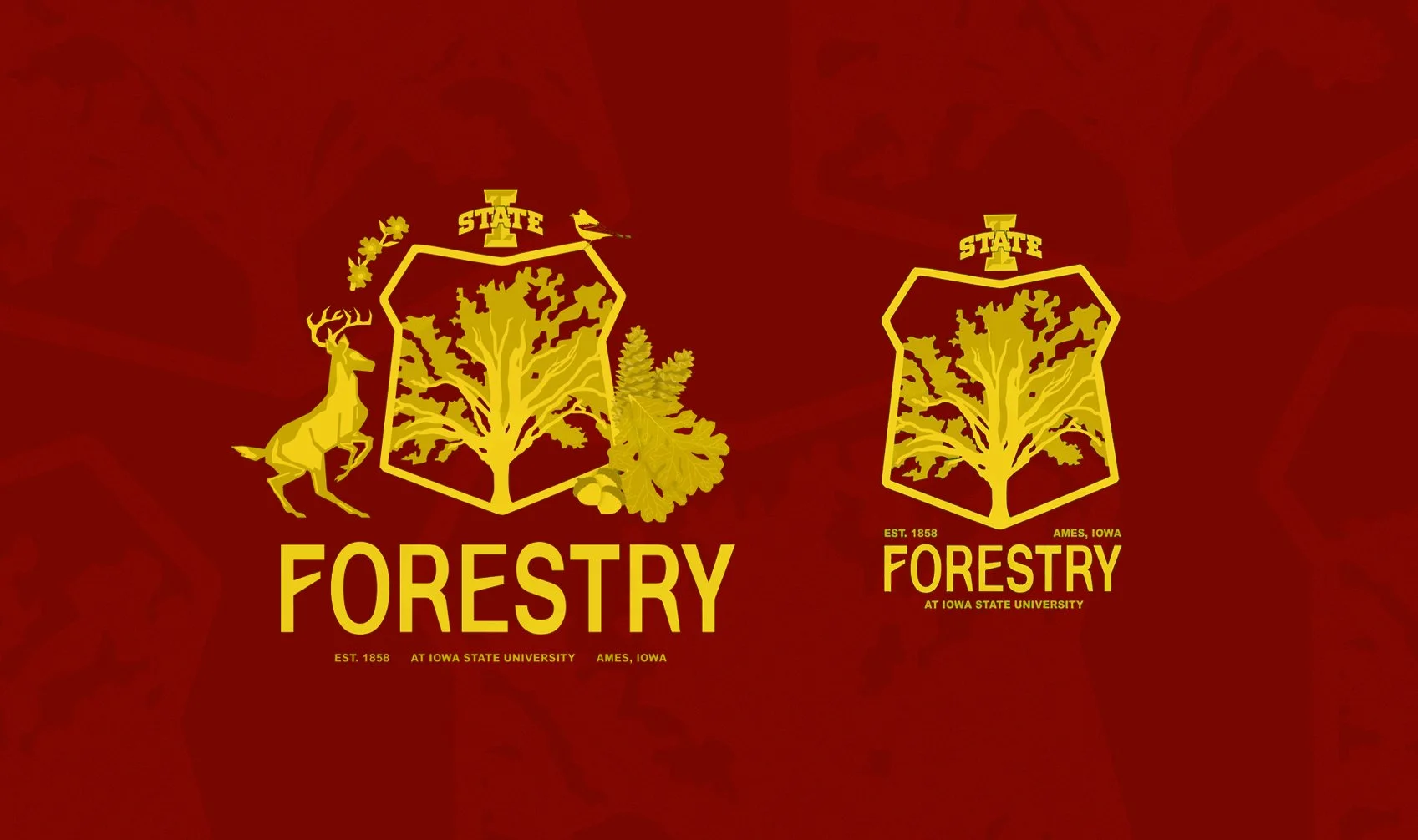
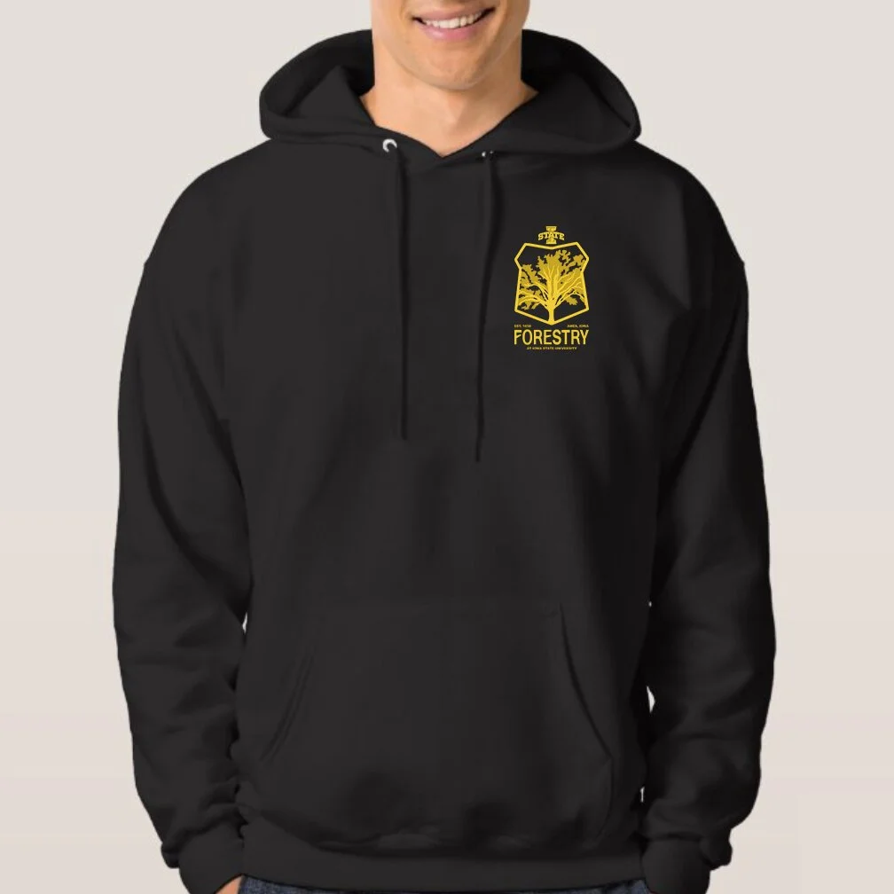
The final crest took two forms- first, a full crest that included all the symbolism the client had requested. Secondly, a more modernized and utilitarian logo that was simplified- this would make it easier to use on merch, and would ultimately be more legible. I created a vector version of the hand-made font from the original crest and carried that through both variations. I also created an iconographic logo for use in watermarks, and to use as a tertiary design element.
The client was very pleased with both versions of the logo!
